- 0.0 Accessibility Training
- 0.1 Who does what
- 0.2 Helpful tools
- 0.3 Checklist
- 0.3 Glossary
- 0.4 Screen readers we support
- 1.0 Buttons and toggles
- 1.0 Bypass blocks
- 1.0 Focus visible
- 1.0 Images and Decorative Elements
- 1.0 Landmark structure
- 1.0 Modals
- 1.0 Non Text Content
- 1.0 Page Title
- 1.0 Tables
- 1.0 Tabs
- 1.0 Test Evidence Spreadsheet
- 1.0 Tooltips
- 1.1 Perceivable - Text alternatives
- 1.2 Perceivable - Time-based media
- 1.3 Perceivable - Adaptable
- 1.4 Perceivable - Distinguishable
- 2.1 Operable - Keyboard accessible
- 2.2 Operable - Enough time
- 2.3 Operable - Seizures and Physical Reactions
- 2.4 Operable - Navigable
- 2.5 Operable - Input Modalities
- 3.1 Understandable - Readable
- 3.2 Understandable - Predictable
- 3.3 Understandable - Input Assistance
- 4.1 Robust - Compatible
Focus visible 2.4.7 (AA)
When a user uses their tab key to move throughout the application a clear focus indicator needs to be shown to the user. This focus style needs to have a colour contrast of at least 4.5:1 across all browsers. To do this it is recommened not to use the default browser focus style as these do not contrast signifcantly across all types of background colours.
It is instead recommend that you create your own unique focus style indicator that will work across any background colour that has be specifically designed for your application.
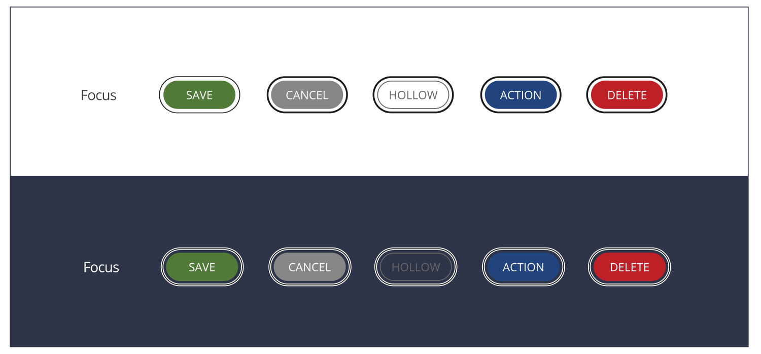
People First’s focus style is created by using a dark line sitting on top of a thinker white line. This means no matter what background colour the focus state sits on it will always contrast against the background.
People First’s focus state styling below
